

Redesigning the Home Experience
Redesigning the Home Experience
Focus Area
Feature discoverability
Reduce onboarding friction
Simplify Setup QR
Focus Area
Feature discoverability
Reduce onboarding friction
Simplify Setup QR
Focus Area
Feature discoverability
Reduce onboarding friction
Simplify Setup QR
Freecharge
Business App
Freecharge
Business App
Freecharge
Business App
Redesigning the Home Experience

Freecharge Business
Freecharge Business is a B2B App for Merchants, who receive digital payments through UPI, cards and other wallets. Freecharge Merchant provides various free & paid features such as:
Khata Book (Ledger Book)
Paisa Plus (Customer Loyalty Program)
Share Payment Link
My Offers (Merchant Promotions)
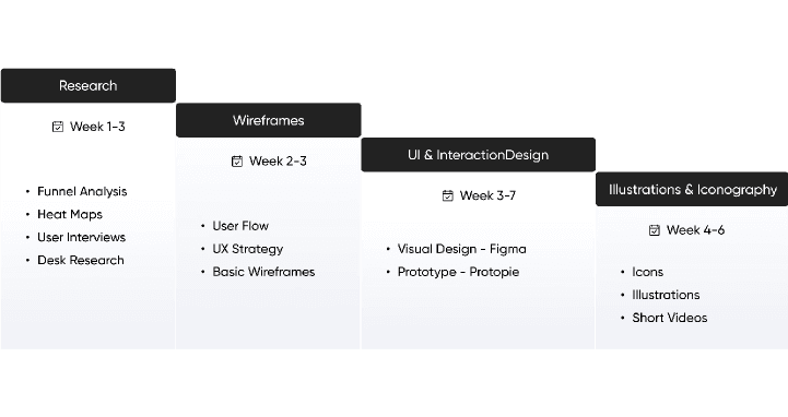
Design Process
Over a focused 6-week sprint, we undertook a data-informed UX redesign to address onboarding drop-offs and low feature adoption in Freecharge Business. Starting with funnel analytics, we identified high-friction steps—particularly during bank account linking—and validated these pain points through on-ground user interviews with local merchants. Leveraging insights, we implemented a progressive disclosure model to reduce cognitive load and improve task completion rates. In parallel, to boost feature discoverability (e.g., Paisa Plus, My Offers), we introduced a contextual discovery module with micro-learning videos embedded directly on the home screen. This cross-functional collaboration with data, product, sales, and marketing not only streamlined onboarding but also drove measurable engagement uplift through just-in-time UX interventions and value-first interactions.

Font Inter
Many Tier 2 merchants use budget Android phones. Inter is engineered for screen legibility, even on lower resolution displays. Its clear letter forms and generous spacing help avoid eye strain during long hours of usage.

The Target User Base
Freecharge Business was built for the backbone of India’s commerce ecosystem—over 50,000 small and medium businesses spread across the country. The focus was clear: empower retail merchants in Tier 2, Tier 3 cities, and rural areas, where digital adoption was accelerating and the need for simple, effective payment solutions was growing fast.
Most users were small business owner like kirana stores, local service providers, and regional retailers—who needed a dependable app to manage transactions, track payments, and grow their business. They typically used mid-range Android phones, priced between ₹10,000 to ₹15,000, striking a balance between affordability and functionality.

Freecharge Business
Freecharge Business is a B2B App for Merchants, who receive digital payments through UPI, cards and other wallets. Freecharge Merchant provides various free & paid features such as:
Khata Book (Ledger Book)
Paisa Plus (Customer Loyalty Program)
Share Payment Link
My Offers (Merchant Promotions)
Design Process
Over a focused 6-week sprint, we undertook a data-informed UX redesign to address onboarding drop-offs and low feature adoption in Freecharge Business. Starting with funnel analytics, we identified high-friction steps—particularly during bank account linking—and validated these pain points through on-ground user interviews with local merchants. Leveraging insights, we implemented a progressive disclosure model to reduce cognitive load and improve task completion rates. In parallel, to boost feature discoverability (e.g., Paisa Plus, My Offers), we introduced a contextual discovery module with micro-learning videos embedded directly on the home screen. This cross-functional collaboration with data, product, sales, and marketing not only streamlined onboarding but also drove measurable engagement uplift through just-in-time UX interventions and value-first interactions.
Font Inter
Many Tier 2 merchants use budget Android phones. Inter is engineered for screen legibility, even on lower resolution displays. Its clear letter forms and generous spacing help avoid eye strain during long hours of usage.
Problems Identified
To inform the redesign, we conducted a comprehensive analysis combining user feedback, inputs from relationship managers (RMs), and customer support insights. In addition, ground-level user interviews were carried out in cities like Gurgaon and parts of Haryana and Uttar Pradesh, in collaboration with our field sales team. These in-person interactions provided valuable context into how merchants interact with the app in real-world settings, helping us uncover usability issues, gaps in feature adoption, and opportunities to improve clarity and engagement across the experience.
Lengthy Onboarding Flow
Insight:
New users were experiencing friction during onboarding due to a lengthy form-filling process. This created drop-offs, especially among less tech-savvy merchants who preferred getting started quickly.
Solution:
We restructured the onboarding into a progressive disclosure model, prompting users only for minimal data initially. High-friction steps like bank account linking were deferred until users actively engaged with relevant features (e.g., Setup QR).
Lengthy Onboarding Flow
Insight:
Some features like Paisa Plus & My Offers which were relatively new to the market, so user were not able to understand this properly because of this there were some initial drop of using these products.
Solution:
We restructured the onboarding into a progressive disclosure model, prompting users only for minimal data initially. High-friction steps like bank account linking were deferred until users actively engaged with relevant features (e.g., Setup QR).
Paisa Plus & My Offers Needed Better Explanation
Insight:
Some features like Paisa Plus & My Offers which were relatively new to the market, so user were not able to understand this properly because of this there were some initial drop of using these products
Solution:
To improve feature discoverability, a temporary Discovery Section was introduced on the home screen, showcasing bite-sized explainer videos through contextual cards. This guided exposure helps merchants understand and adopt these features gradually, after which the section phases out automatically.
Limited Visibility of Transactions & Settlements
Insight:
Merchants repeatedly checked recent transactions & payout details, but these critical data points were scattered across the interface, lowering efficiency.
Solution:
We merged transactions and settlements into a unified tabbed interface, making both equally accessible .
The tab component was repositioned to the top of the home screen- above the fold-based on usage heatmaps that confirmed users frequently sought this information immeditely upon login. This ensures high priority content is front and center.
Underutilized Scan QR Feature
Insight:
Despite being a core action, the “Scan QR” feature lacked prominence in the previous layout. Setup completion rates for QR activation were also lower than expected.
Solution:
We elevated the Scan QR icon to a prominent top-right position on the home screen to increase visibility and tap-through rates. Additionally, the QR Setup prompt was incorporated into the new discovery section with contextual messaging, highlighting its importance
Designing the Wireframe
Designing the Wireframe
The wireframe phase focused on simplifying access to key actions, improving feature discoverability, and guiding users through essential setup tasks. Each design decision was driven by user feedback and funnel data, aiming to reduce friction and increase early engagement. From persistent banners to contextual cues, the layout was restructured to feel intuitive, informative, and action-oriented for busy merchants.
The wireframe phase focused on simplifying access to key actions, improving feature discoverability, and guiding users through essential setup tasks. Each design decision was driven by user feedback and funnel data, aiming to reduce friction and increase early engagement. From persistent banners to contextual cues, the layout was restructured to feel intuitive, informative, and action-oriented for busy merchants.
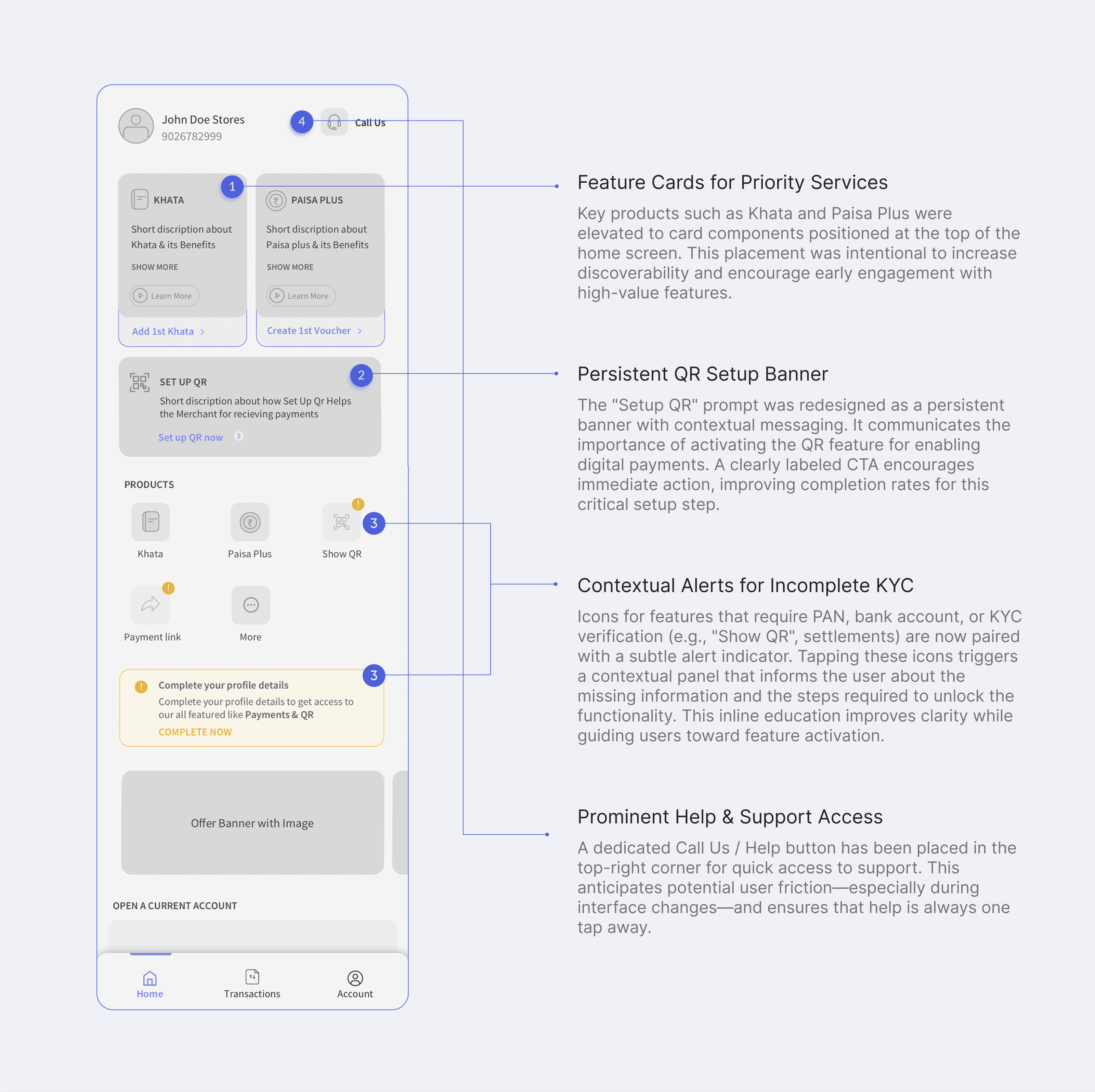
Insight:
Despite being a core action, the “Scan QR” feature lacked prominence in the previous layout. Setup completion rates for QR activation were also lower than expected.
Solution:
We elevated the Scan QR icon to a prominent top-right position on the home screen to increase visibility and tap-through rates. Additionally, the QR Setup prompt was incorporated into the new discovery section with contextual messaging, highlighting its importance
Paisa Plus & My Offers Needed Better Explanation
Insight:
Some features like Paisa Plus & My Offers which were relatively new to the market, so user were not able to understand this properly because of this there were some initial drop of using these products.
Solution:
To improve feature discoverability, a temporary Discovery Section was introduced on the home screen, showcasing bite-sized explainer videos through contextual cards. This guided exposure helps merchants understand and adopt these features gradually, after which the section phases out automatically.
Limited Visibility of Transactions & Settlements
Insight:
Merchants repeatedly checked recent transactions & payout details, but these critical data points were scattered across the interface, lowering efficiency.
Solution:
To improve feature discoverability, a temporary Discovery Section was introduced on the home screen, showcasing bite-sized explainer videos through contextual cards. This guided exposure helps merchants understand and adopt these features gradually, after which the section phases out automatically.
Underutilized Scan QR Feature
Solutions:
We merged transactions and settlements into a unified tabbed interface, making both equally accessible .
The tab component was repositioned to the top of the home screen- above the fold-based on usage heatmaps that confirmed users frequently sought this information immeditely upon login. This ensures high priority content is front and center.
Insight:
Despite being a core action, the “Scan QR” feature lacked prominence in the previous layout. Setup completion rates for QR activation were also lower than expected.
Solution:
We elevated the Scan QR icon to a prominent top-right position on the home screen to increase visibility and tap-through rates. Additionally, the QR Setup prompt was incorporated into the new discovery section with contextual messaging, highlighting its importance
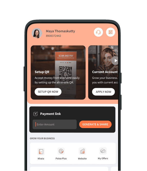
The Final Visual Design
The redesigned interface adopts a progressive disclosure strategy, revealing features gradually as users engage with the app. Key setup steps like KYC and bank linking are now triggered contextually, reducing friction during onboarding. The discovery section introduces core features—like Current Account and Paisa Plus—via informative cards and explainer videos.
As users complete initial tasks, the section seamlessly transitions to show Transactions & Settlements, ensuring the interface evolves with user needs.

The Target User Base
The Target User Base
Freecharge Business was built for the backbone of India’s commerce ecosystem—over 50,000 small and medium businesses spread across the country. The focus was clear: empower retail merchants in Tier 2, Tier 3 cities, and rural areas, where digital adoption was accelerating and the need for simple, effective payment solutions was growing fast.
Most users were small business owner like kirana stores, local service providers, and regional retailers—who needed a dependable app to manage transactions, track payments, and grow their business. They typically used mid-range Android phones, priced between ₹10,000 to ₹15,000, striking a balance between affordability and functionality.
Designing the Wireframe
The wireframe phase focused on simplifying access to key actions, improving feature discoverability, and guiding users through essential setup tasks. Each design decision was driven by user feedback and funnel data, aiming to reduce friction and increase early engagement. From persistent banners to contextual cues, the layout was restructured to feel intuitive, informative, and action-oriented for busy merchants.
Thanks for Watching!
Thanks for Watching!
Designed with Framer by Roshan Prasad
The Final Visual Design
The redesigned interface adopts a progressive disclosure strategy, revealing features gradually as users engage with the app. Key setup steps like KYC and bank linking are now triggered contextually, reducing friction during onboarding. The discovery section introduces core features—like Current Account and Paisa Plus, via informative cards and explainer videos.
As users complete initial tasks, the section seamlessly transitions to show Transactions & Settlements, ensuring the interface evolves with user needs.
