

Designing Wealthy AI
Designing Wealthy AI:
Smart, Simple, and Seamless UX for Financial Workflows
A case study on integrating AI into an existing advisor workflow
Company
Wealthy.in
Duration
1 Month
Industry
Wealth Tech
About
Wealthy is a fintech platform built for financial advisors, helping them manage client data, assess financial health, and deliver informed, goal-driven guidance efficiently. Advisors rely on the Wealthy Partner App on a daily basis, which means any new capability must enhance speed and clarity without disturbing established workflows.
This case study explores how we as a design team introduced WealthyAI, a conversational assistant designed to support advisors in handling complex, data-heavy tasks. The challenge wasn’t just to add AII, it was to do so in a way that felt intuitive and seamlessly embedded into an already mature product.
Problem Statement
Where and How?
Where and how to introduce AI? We needed to pinpoint the parts of the advisor’s journey
where an AI assistant would be genuinely useful.
Keeping the flow Simple
Despite the intelligence running behind the scenes, the experience had to feel effortless. Advisors should complete tasks faster, not learn a new system. That meant a minimalist AI interface that blends seamlessly into the existing design language, avoids unnecessary complexity, and feels like a natural extension of the app rather than a flashy add-on.
Ensuring feedback loops
Since AI isn’t perfect (it might fetch imperfect results or misunderstand queries), we needed a robust feedback mechanism. This would both help users feel in control (they can correct or rate the AI’s response) and provide data for us to improve the system over time..
About
Wealthy is a fintech platform built for financial advisors, helping them manage client data, assess financial health, and deliver informed, goal-driven guidance efficiently. Advisors rely on the Wealthy Partner App daily, which means any new capability must enhance speed and clarity without disturbing established workflows.
This case study explores how we introduced WealthyAI, a conversational assistant designed to support advisors in handling complex, data-heavy tasks. The challenge wasn’t just to add AII, it was to do so in a way that felt intuitive and seamlessly embedded into an already mature product.
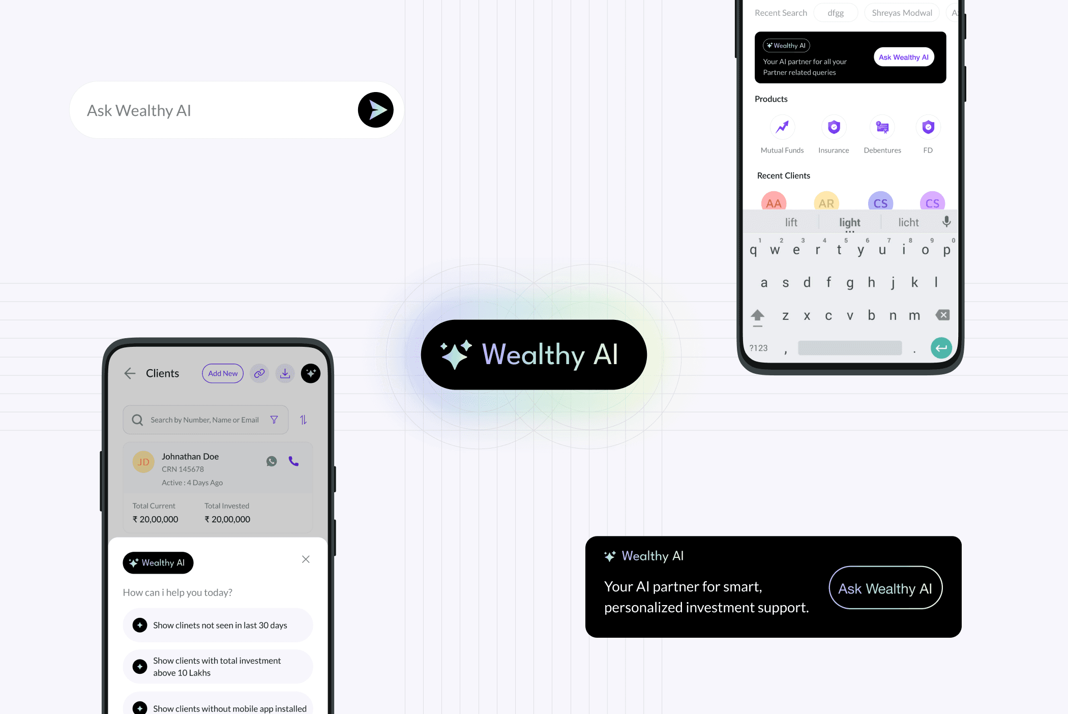
Naming and Visual Identity
From the outset, we chose to call the feature “Wealthy AI.” This naming felt natural it extends our brand and immediately communicates that this is an AI helper within our ecosystem. We considered giving the assistant a more persona like name, but sticking with Wealthy AI kept it professional and clear for our audience of financial advisors. It’s an assistant that belongs to the Wealthy app suite, reinforcing familiarity.For the visual identity, we wanted the AI feature to stand out as something new yet still feel aligned with the app’s design. The icon we landed on was a simple star symbol inside a dark circle, chosen for its familiarity and positive connotation. A star suggests a “highlight” or a guiding light a friendly cue that this feature can illuminate answers for the user.
Where and How?
Where and how to introduce AI? We needed to pinpoint the parts of the advisor’s journey where an AI assistant would be genuinely useful.
Keeping the flow Simple
Despite the intelligence running behind the scenes, the experience had to feel effortless. Advisors should complete tasks faster, not learn a new system. That meant a minimalist AI interface that blends seamlessly into the existing design language, avoids unnecessary complexity, and feels like a natural extension of the app rather than a flashy add-on.
Ensuring feedback loops
Since AI isn’t perfect (it might fetch imperfect results or misunderstand queries), we needed a robust feedback mechanism. This would both help users feel in control (they can correct or rate the AI’s response) and provide data for us to improve the system over time..
Naming & Visual Identity
From the outset, we chose to call the feature “Wealthy AI.” This naming felt natural it extends our brand and immediately communicates that this is an AI helper within our ecosystem. We considered giving the assistant a more persona like name, but sticking with Wealthy AI kept it professional and clear for our audience of financial advisors. It’s an assistant that belongs to the Wealthy app suite, reinforcing familiarity.For the visual identity, we wanted the AI feature to stand out as something new yet still feel aligned with the app’s design. The icon we landed on was a simple star symbol inside a dark circle, chosen for its familiarity and positive connotation. A star suggests a “highlight” or a guiding light a friendly cue that this feature can illuminate answers for the user.

To signal that Wealthy AI is a distinct, modern experience, we treated its UI with a different color scheme. The main app uses a clean white and brand purple palette, so injecting black for the AI panels created instant contrast.
Integration Points
One of our biggest decisions was where to surface the new AI assistant. Rather than create a standalone section for it, we integrated Wealthy AI into two key touchpoints in the existing user journey. These were chosen based on usage analytics and user interviews pinpointing where advisors could benefit from a helping hand.
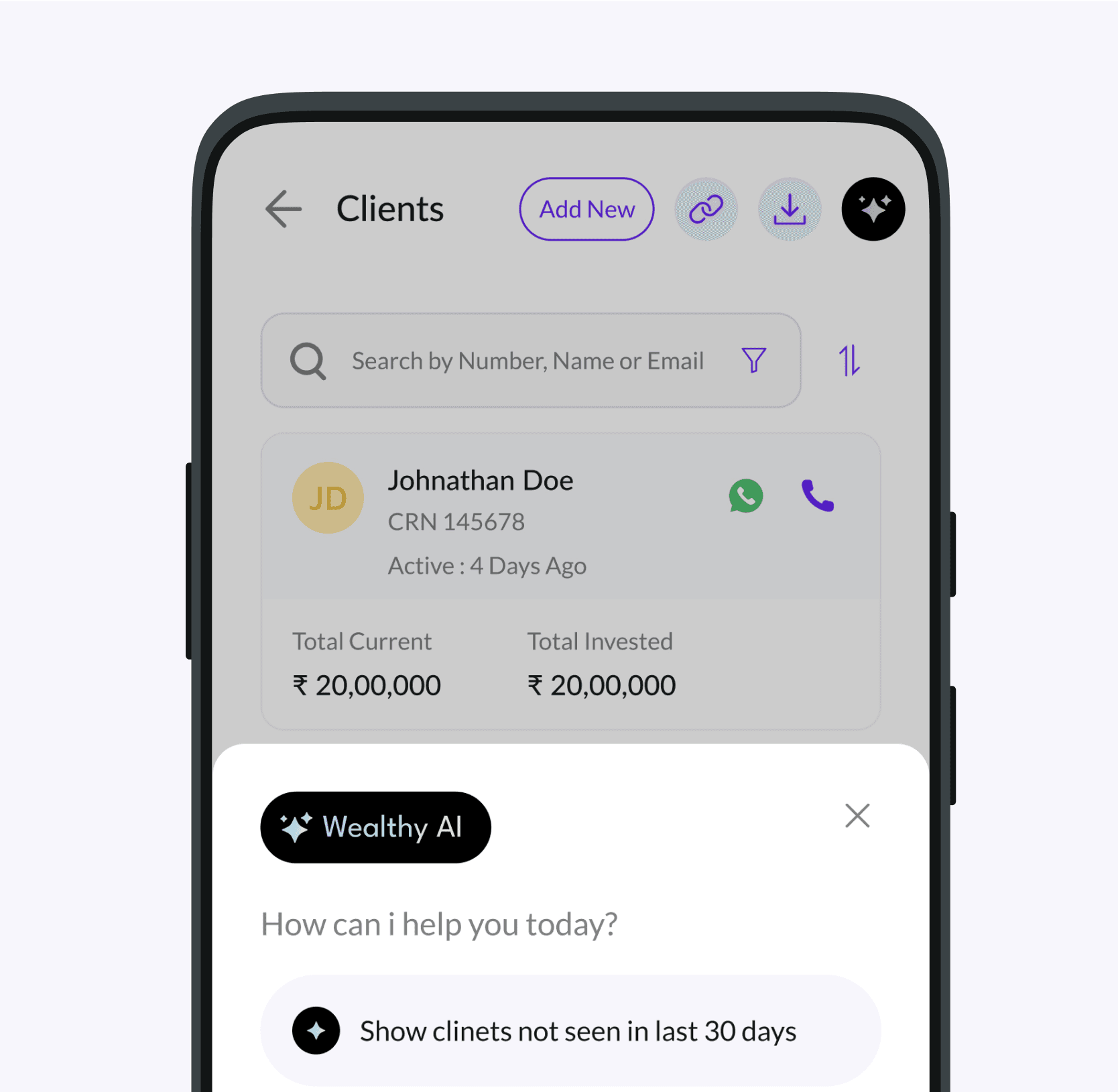
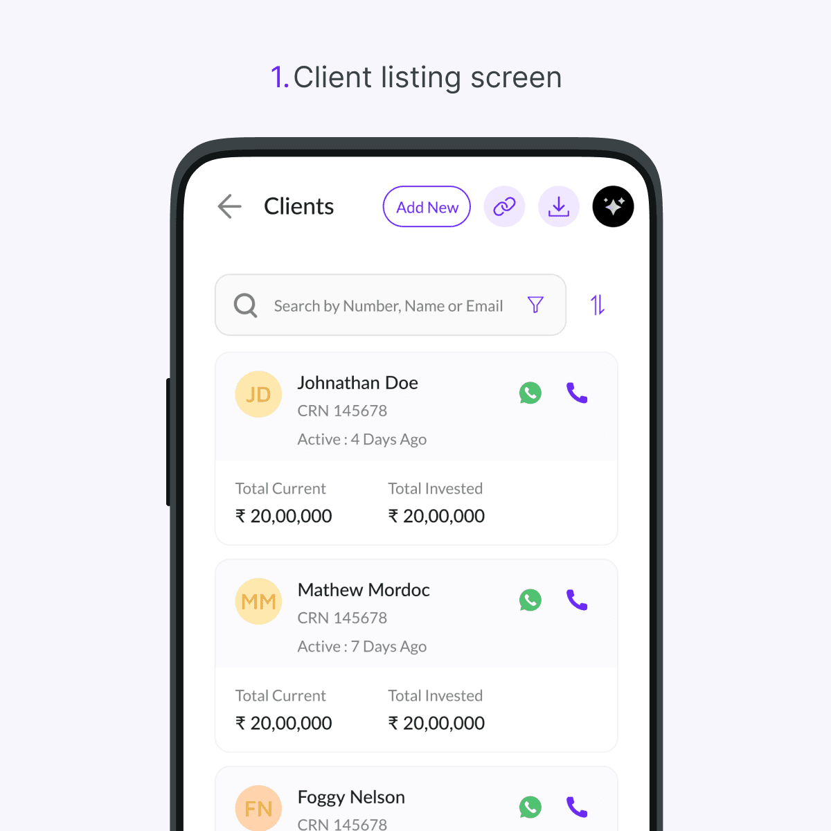
1.Client listing Screen
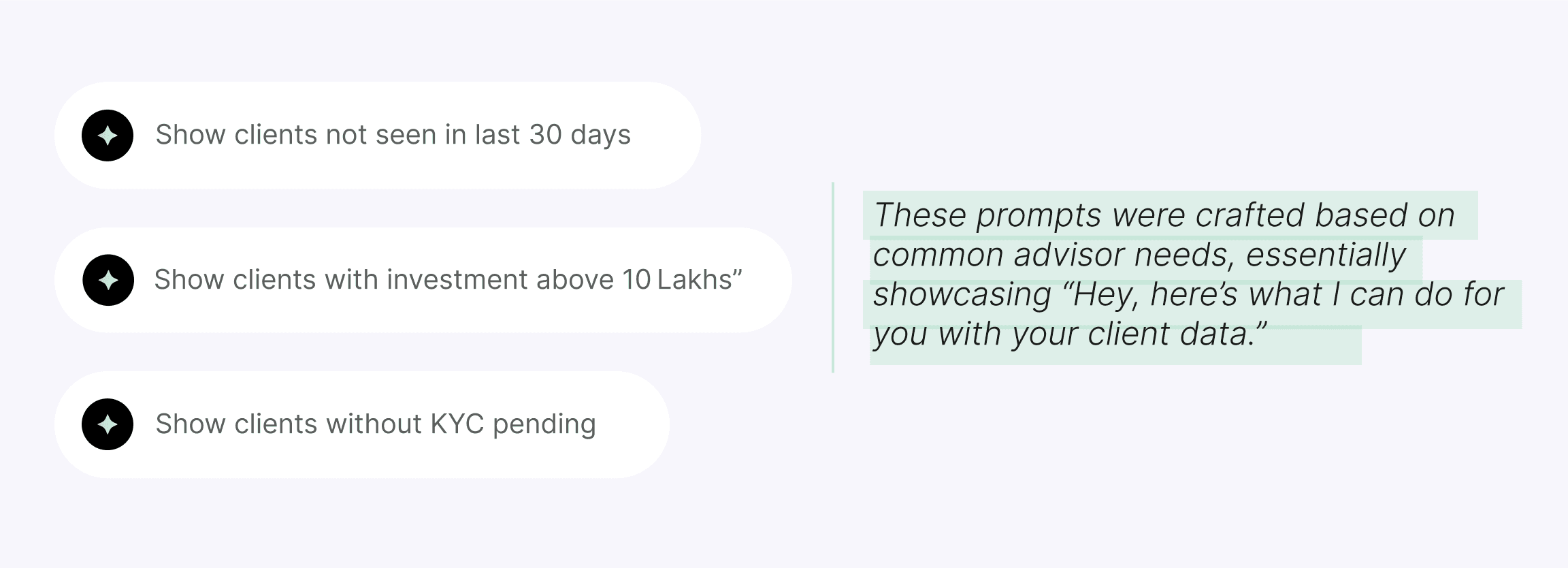
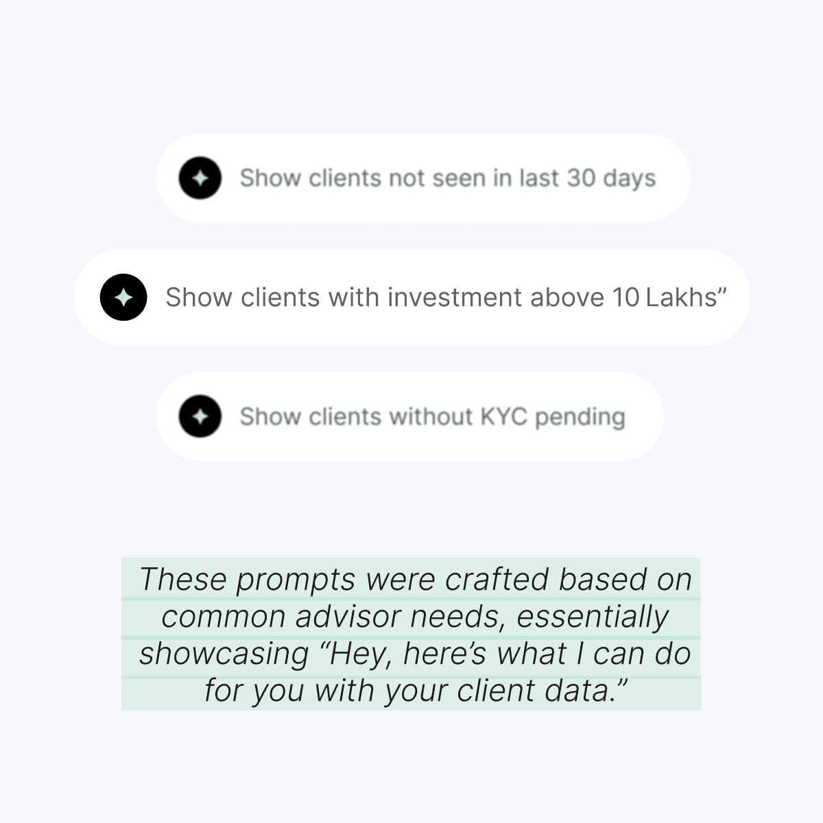
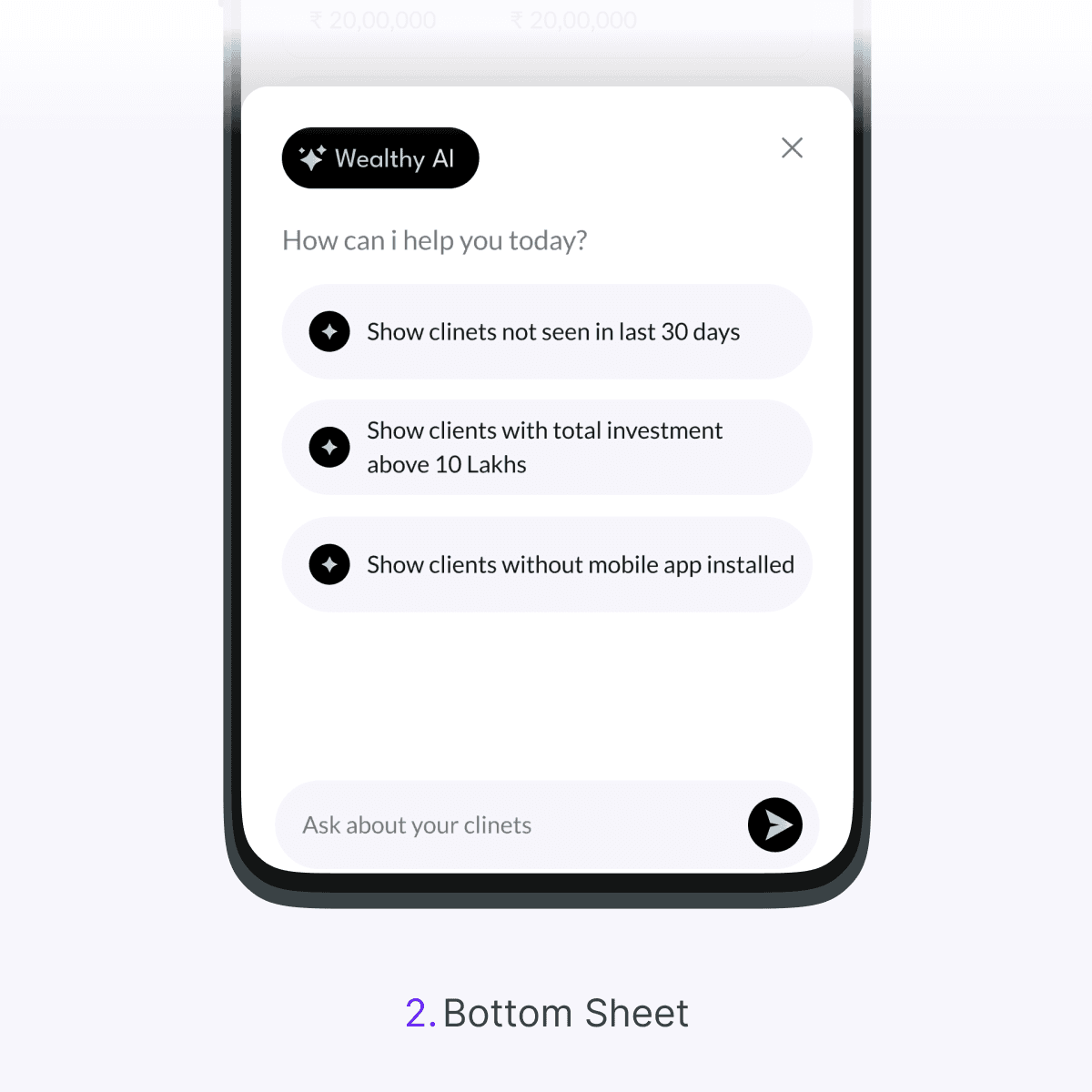
On the Clients screen, we added a star-shaped Wealthy AI icon at the top right corner (alongside existing actions). This is one of the most frequently used screens advisors constantly browse and manage their client list making it a prime spot to introduce AI. Tapping the star icon slides up a chat-style bottom sheet UI (as shown above) without navigating away. We designed it this way so that the advisor still sees the context (the client list behind the sheet) while interacting with the AI. The panel greets the user with “How can I help you today?” and, importantly, offers a few one-tap query suggestions related to client management. These prompts were crafted based on common advisor needs.
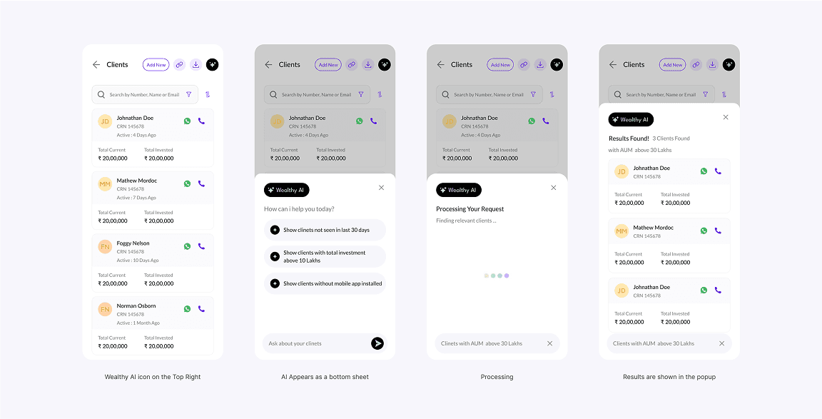
Either typed or selected from suggestions, Wealthy AI responds with a conversational loading prompt within seconds, results appear in a scrollable bottom sheet, styled as familiar client cards filtered to match the query. Advisors can tap into details
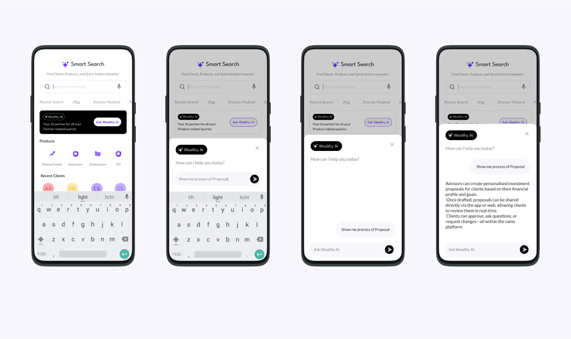
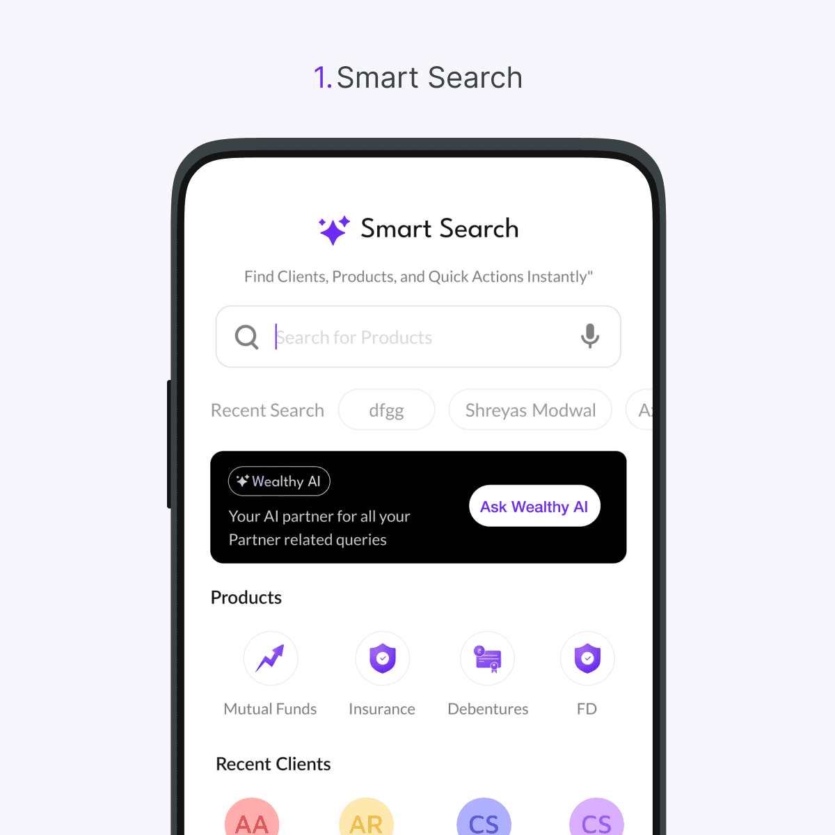
2.Universal Search (Smart Search)
The second entry point was the app’s “Smart Search” hub – a universal search page where advisors find clients, products, and quick actions. We gave Wealthy AI prominent billing here in the form of an “Ask Wealthy AI” banner on the search screen. This banner (a black card component) sits right below the search bar and recent search chips, introducing the AI assistant in-context with a short tagline. It reads: “Your AI partner for all your Partner related queries” and features a button labeled “Ask Wealthy AI.” The design intention was to make it immediately obvious that, beyond typing keywords, the user can ask complex or natural language questions to the system. The black banner with the star icon and AI label contrasts with the rest of the page, serving as a gentle nudge that says “Try the new AI feature!” without forcing it.
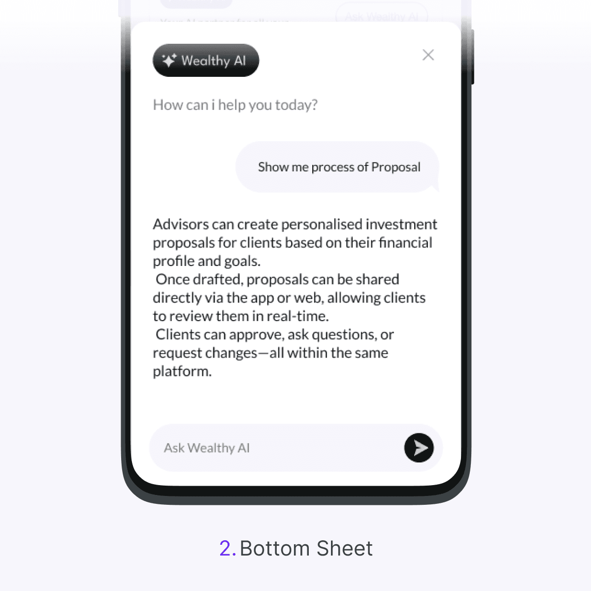
Tapping Ask Wealthy AI from the Smart Search screen opens the same bottom-sheet chat interface—consistent in layout but broader in scope. Here, prompts span procedural and data-driven queries, like “How can I transfer my external folios?” or “Show me proposals I sent today.” Responses are rich and contextual, often combining step-by-step instructions with visuals or thumbnails—all delivered in-line, so users get answers without leaving the screen..
Design Decision Highlights
There were 4 key design decisions that shaped Wealthy AI’s user experience:
✦ Visual contrast with gradients
We used a bold black backdrop with soft purple gradients to distinguish AI elements like chat headers and cards. This high-contrast style signaled a “tech-forward mode” while staying on-brand. Core typography and UI components remained consistent for a unified experience.
✦ Pre-defined prompt suggestions
Predefined prompts serve as a helpful nudge for new users, offering a clear starting point to explore what the AI can do. For users unfamiliar with the system, the open-ended nature of AI can feel overwhelming.
Conversational UI via bottom sheet.
✦ Conversational UI via bottom sheet
We used a bottom sheet pattern to anchor the AI chat without disrupting context. It allows multitasking, feels natural like a chat, and keeps the user grounded creating the sense that they’re still on the same screen.
We used a bottom-sheet pattern to anchor
the AI chat without disrupting context.
It allows multitasking, feels natural like a chat,
and keeps the user grounded,creating the
sense that they’re still on the same screen.
✦ Nudging discoverability.
To promote Wealthy AI without being intrusive, we added a clear “Ask Wealthy AI” card in Smart Search and a standout star icon on the Clients screen. These subtle, context-aware cues guided users to explore the feature organically no tooltips or pop-ups needed..
Design Decision Highlights
Pre-defined prompt suggestions.
Predefined prompts serve as a helpful nudge for new users, offering a clear starting point to explore what the AI can do. For users unfamiliar with the system, the open-ended nature of AI can feel overwhelming. By presenting ready-to-use suggestions, we lower the entry barrier, reduce hesitation, and make it easier for users to use the feature.
Visual contrast with gradients and black.
We used a bold black backdrop with soft purple gradients to distinguish AI elements like chat headers and cards. This high-contrast style signaled a “tech-forward mode” while staying on-brand. Core typography and UI components remained consistent for a unified experience.
Either typed or selected from suggestions, Wealthy AI responds with a conversational loading prompt within seconds, results appear in a scrollable bottom sheet, styled as familiar client cards filtered to match the query. Advisors can tap into details
2.Universal Search (Smart Search)
Despite the intelligence running behind the scenes, the experience had to feel effortless. Advisors should complete tasks faster, not learn a new system. That meant a minimalist AI interface that blends seamlessly into the existing design language, avoids unnecessary complexity, and feels like a natural extension of the app rather than a flashy add-on.
Either typed or selected from suggestions, Wealthy AI responds with a conversational loading prompt within seconds, results appear in a scrollable bottom sheet, styled as familiar client cards filtered to match the query. Advisors can tap into details
Nudging discoverability.
To promote Wealthy AI without being intrusive, we added a clear “Ask Wealthy AI” card in Smart Search and a standout star icon on the Clients screen. These subtle, context-aware cues guided users to explore the feature organically no tooltips or pop-ups needed.
Thanks for Watching!
To signal that Wealthy AI is a distinct, modern experience, we treated its UI with a different color scheme. The main app uses a clean white and brand purple palette, so injecting black for the AI panels created instant contrast.
Integration Points
One of our biggest decisions was where to surface the new AI assistant. Rather than create a standalone section for it, we integrated Wealthy AI into two key touchpoints in the existing user journey. These were chosen based on usage analytics and user interviews pinpointing where advisors could benefit from a helping hand.
1.Client listing Screen
Despite the intelligence running behind the scenes, the experience had to feel effortless. Advisors should complete tasks faster, not learn a new system. That meant a minimalist AI interface that blends seamlessly into the existing design language, avoids unnecessary complexity, and feels like a natural extension of the app rather than a flashy add-on.
Thanks for Watching!
Thanks for Watching!
Designed with Framer by Roshan Prasad
Thanks for Watching!
Company
Wealthy.in
Duration
1 Month
Industry
Wealth Tech